 Our own system
Conduction
The default for every screen. Cobalt is what you can do, the text-safe orange marks where you are, and Figtree carries all text. The full system lives on its own pages.
Palette
 Demo municipality
Gemeente Zuiddrecht
The municipality we use to show every Conduction app. Residents find information, apply and follow their cases on the website and in Mijn Zuiddrecht. Staff work in Nextcloud. Blue is what you can do, the red of the coat of arms says where you are, and Fira Sans keeps it plain and readable.
Palette
Type
Logo set


Motif
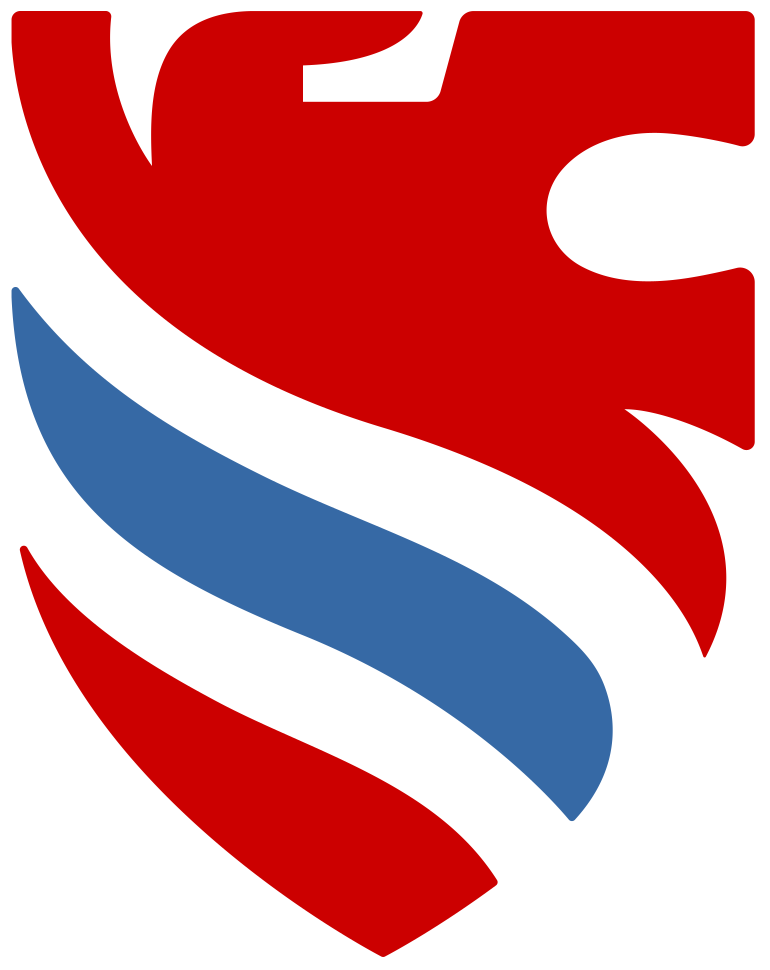
The red line. A short red bar under the active menu item and the page title tells residents where they are. Everything else stays white and blue.
 Example product style
OpenProject
The look of the OpenProject application, measured on community.openproject.org and on openproject.org. Use it to see our screens the way an OpenProject user would. Blue is the header and every link. Green is the one button that creates or sends. This is an example style, not an official OpenProject theme.
Palette
Type
Logo set


Motif
The blue bar. A full-width blue header carries the logo and the search field. Below it everything is white, with thin grey lines between rows and coloured dots for status.
 Example government style
Rijkshuisstijl (voorbeeld)
The colours, type scale and spacing of the Dutch central government, from the open NL Design System community tokens (version 18.0.1). Use it to see our screens the way a ministry or an agency would. Lintblauw is the header and every button, donkerblauw is a link, and corners are square. The logo, the wordmark and the fonts are reserved for the central government, so the screens carry a plain crown mark of our own and set the text in Fira Sans, the package's own fallback. This is an example style, not a government site. Its variables are not typed here: scripts/screens/sc_from_thematiq.py derives them from thematiq's rijkshuisstijl token set, the NL Design System tokens the real apps run on, with the same mapping thematiq uses for a Nextcloud page. The boards also get the NL Design System look: squared controls, bold button labels, a visible field edge, underlined links in prose and a black focus ring.
Palette
Type
Logo set


A classic crown of our own. The logo files carry it in the manner of an engraving: a jewelled band with a pearl rim and ermine tails, five arches set with pearls, and an orb and cross on top. The emblem files carry its silhouette for small sizes, such as the bar: a wide jewelled band, three arches meeting under the orb and cross. It is not the Rijksoverheid logo and not the state coat of arms, which only the central government may use. The crown stands in for the organisation logo on every screen in this style.
Motif
The lint. A narrow lintblauw bar hangs from the top edge of the app header on the far left, past the header's bottom edge, with the crown in white near its foot. Beside it stand the organisation and the app name. The organisation is the fictional Ministerie van Voorbeeldzaken, as Zuiddrecht is our fictional municipality. Below it everything is white and square, with cool grey lines and donkerblauw links.
 Primary school, ages 4 to 12
Basisschool De Wilgenboom
The tree you shelter under. Warm, calm and clear for busy parents, friendly without being childish. Parents report a child absent, read news from the group, book a parent evening and see report cards in Mijn Wilgenboom. Lexend was designed for reading ease, which is the school's subject.
Palette
Type
Logo set



Motif
De twijgen: the willow's hanging twigs. A row of short bars with round ends hangs from a line in uneven lengths, green with now and then a yellow one. It closes the header, opens the footer and marks the sign-in screen.
 Secondary school, vmbo-t, havo and vwo
Vaartveld College
The long view down the canal. Clear, confident and a little bold: a school for 12 to 18 year olds that takes them seriously. Pupils see today's timetable, homework and grades; parents report sick and book a mentor talk. Red Hat Display sets the headings, Red Hat Text the reading.
Palette
Type
Logo set



Motif
De vaart: two parallel lines, the canal and its bank. A 4 px cobalt line, 3 px of white, a 2 px aqua line. It closes the header and opens the footer. On the sign-in screen and in the home hero the emblem's folded V stands large and pale.
 Vocational college
Esdoornveen, mbo college
Learning that leads to a trade. Practical and grown-up: students are 16 and older and half their learning happens in a company. Students log work-placement hours and see assessments; the company approves hours. It feels closer to a professional tool than to a school. IBM Plex Sans for text, Plex Mono for codes.
Palette
Type
Logo set


Motif
De snede: a slanted cut, like the edge of a maple leaf. A 6 px plum band holds one rose segment whose ends are cut at an angle. It closes the header and opens the footer, and returns at most once per page.
 Training for heat-pump installers
Warmtepompacademie
Heat moves from cold to warm. A trade academy for installers: exact, technical, no fuss. Participants and their employers want a date, a place, a price and a certificate. They find a course, enrol employees and download certificates. Barlow Semi Condensed sets headings and numbers, Barlow the text.
Palette
Type
Logo set



Motif
De temperatuurlijn: a 5 px line in five hard steps from cold to warm, no gradient, petrol through grey to ember. It closes the header and opens the footer.